BURKE WILLIAMS
WEBSITE OVERHAUL
Solo Project
2 Week Duration
User experience design, UI, visual, and research to fix a famously terrible web interface-- Burke Williams. The focus was on redesigning the gift-buying flow, and cleaning up their payment scheme. After doing just a few usability tests, it was clear to me that Burke was loosing a lot of sales due to their frustrating, cryptic, and hard to navigate website. I also did an aggressive overhaul of their visual design because my research revealed that the luxurious in-store experience was not reflected in its website. And let's face it--If you are charging 600$ to throw some mud on a person's face, your website damn well better look like it.
GOAL 1:
SIMPLIFY
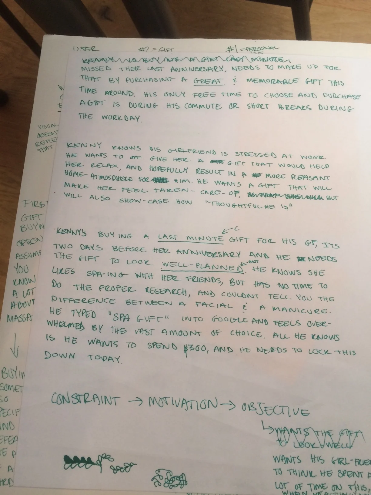
Usability tests revealed that people would get frustrated and abandon the gift purchase about 5 minutes in, overwhelmed by choice and confused by the options
SOLUTION: less options, big icon purchase buttons, less time spent researching
EMOTIONAL GOAL:
NO ONE SHOULD FEEL STUPID
The current website was painfully unclear. In an interview, I learned that at the heart of it, the main reason for abandonment was that the current proccess, and lack of explanation of treatments made folks feel stupid. And no one should feel stupid when trying to buy a gift for a loved one.
SOLUTION: Lots of pictures, explanations of treatments, and a 10 sec GIF of the actual treatment which plays on hover--Because most 28 year-old men don't have the faintest idea what goes on during an "Auyervedic oil journey"
GOAL 2:
RELAXING AND LUXURIOUS ONLINE EXPERIENCE
Redo the website so that the process of using the website actually reflected the experience of attending the spa.
SOLUTION: change fonts/color scheme/entire brand, use blurs to mimic the frosted glass you see in spas, slower drawn out transitions/button interactions to give the feeling of relaxation
PAYMENT FORM DESIGN
... because in the end, this is eCommerce:
no matter what, we need to get folks through the payment forms as quickly and effortlessly as possible.
COMPETITIVE ANALYSIS


SKETCHES & BRAIN VOMIT


